20 years ago today, the 'Most Annoying Webpage' was launched, trapping victims in popups for a few minutes
In 2003, the internet was a lot more innocent. People happily clicked suspicious looking links, browsers trusted websites implicitly, and instead of malware we had pranks and time-wasters. “Most Annoying Webpage” was one of these, taking a few precious minutes out of any victim’s day.
What was it?
The “Most Annoying Webpage” realistically wasn’t that annoying. It queued up 151 alerts, forcing the user to click “OK” on each one individually. Due to browsers being a bit too trusting of websites in the early internet, there was no way to change tab, dismiss all remaining alerts or any similar workaround. Additionally, as many users weren’t expert computer users, many would have manually clicked the “OK” button instead of holding down enter.
You can view an archived version of the site here and click “Yes, I’m Sure” to begin displaying the alerts. On any modern browser they won’t cause any issues, and can be dismissed by just changing tab.
Once a victim makes their way through all the alerts, they are prompted to send their friends a link via “TAF Master”, an advertising link manager (similar to adf.ly today). Considering this link was active throughout the site’s lifetime, it’s likely advertising revenue was the main goal of the developer. The preticked boxes for the referral form1 give a good indicator of how much spam you’d likely receive!
Timeline
- 20th March 2003: Most Annoying Webpage created and launched2.
- 1st April 2003: First Wayback Machine archive of Most Annoying Webpage, appropriately on April Fool’s Day3.
- 14th April 2003: First mention of Most Annoying Webpage online, on Slashdot4
- May 2003: Most Annoying Webpage spreads through technology forum’s threads (Anandtech5, Howard Forums6, Blender Artists7)
- July 2003: Most Annoying Webpage spreads through general forum’s threads (Digital Photography Challenge8, Airliners.net9)
- 11th July 2003: First and only mention of Most Annoying Webpage in a (political) news site10.
- 20th March 2005: Most Annoying Webpage becomes owned by a series of advertising / parking services11.
- Between 17th May - 14th October 2014, Most Annoying Webpage begins hosting a german spam blog12, and continues to this day.
Alert analysis
The site’s source code is available at annoying-source.txt, and the plaintext alerts can be viewed at annoying-alerts.txt.
Dynamic alerts
In the plaintext alert file, there are 2 sets of messages that I have annotated with (DYNAMIC). In the original source code these are small JavaScript functions that accept input from the user (for their name and a topic suggestion) before lightly mocking them.
Alert miscount
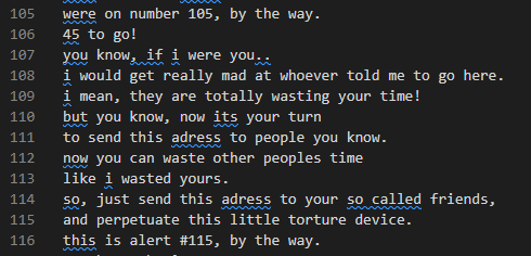
Despite the creator’s claim of 150 alerts, there are actually 151! This miscount seems to creep in between alerts #105 and #116:
Metadata
According to an online text analyser13:
- There are 893 words.
- The most used word is you, with 59 occurrences.
- The most used phrase is you know with 11 occurrences.
- The longest reused phrases are alert after alert after alert and to get through 150 alerts, both used twice.
Whilst this was perhaps obvious from reading a few dialogs, basic online automated readability tools14 agreed the writing was very, very simple and easy to read for almost all ages:
Legacy
Better alert blocking
As described in the talk embedded below, alerts used to be all-powerful. They could lock your browser up, trapping you on the web page, potentially forcing you to restart your entire machine. Most of the web had this power, and due to countless abuses we finally ended up in the more regimented security structure we have now. The talk also discusses how that’s now starting to change, potentially making the web more risky:
Essentially every browser / OS with a public bug tracker saw complaints about these alert traps in the early-mid 2000s (e.g., Mozilla15, GNOME16). Since then, a number of changes have happened that took away any risk from these sorts of sites:
- Tabs became isolated. Now if a page shows you an alert, you can just change tabs and the problem is solved.
- Browsers became more aware of maliciuous JavaScript. If you change to another tab, when you return only the final alert will be shown.
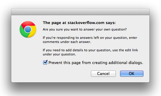
- The ability to block additional dialogs was added to Chromium browsers (although this doesn’t work for Most Annoying Webpage):
Rehosts
There are still a few copies of the site available online, since it’s very simple to copy the basic JavaScript & HTML. It is available on the previously popular Albino Blacksheep17, as well as direct copies without referral links18, and with19.
Similar sites
Whilst looking into this topic, I found TheAnnoyingSite.com from 2017/2018. I’m not going to link to it directly, since it lives up to the name far more than “Most Annoying Webpage” does! Looking at the source code, it makes odd Google searches, plays noises, spawns popups, logs you out of various sites, and other things that might actually cause a problem. There’s a full explanation in the creator Feross Aboukhadijeh’s talk on YouTube (also embedded above). In comparison, Most Annoying Webpage is far more innocent.
However, considering the different directions & complexity both sites took from the core concept (“What if a site was annoying?”), I highly doubt there’s any connection. I reached out to Feross, and he confirmed the sites were unrelated, although he did remember stumbling across “Most Annoying Webpage” when younger!
Notes
Author
I tried to find the creator behind this site, and completely failed:
- Original DNS records have privacy protection.
- No contact details are provided, the only name in the source code is for a free-to-use code snippet.
- As mentioned in Similar sites, I reached out to the author of a similar site who confirmed there was no connection.
- The referral link20 is on the now defunct “TAFMaster”, which appears to have disappeared sometime between 2011 and 2017, with very little trace. It does not appear to have had any customer lookup / database leak.
Technical
It’s unlikely the creator had much JavaScript experience. The source code shows the only non-trivial JavaScript (using text from the user) is copied from elsewhere. More tellingly, the exact same code is used both times the site asks for user feedback, even down to the variable names! Storing both the user’s name and their conversation topic in namePrompt for no reason is unlikely to be the work of an experienced programmer.
Webpage vs website
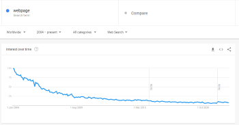
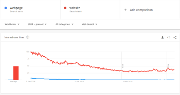
It’s entirely possible the phrase “webpage” looks weird to some readers! For a while this was a common term to refer to a page on a website. Looking at Google Trends however, it’s clear “webpage” is now essentially unused, even in comparison to 2004. If the chart extended further back in time, I would expect an even sharper drop.
| Webpage over time | Webpage vs website |
|---|---|
 |
 |
Conclusion
I’m stunned with how quickly this site dropped off the internet’s radar. The fact that I must have experienced it aged 11-13, yet still remember it distinctly 18-20 years later is somewhat startling. This is the closest I’ve come to “lost media” on this site, hopefully I’ve helped ensure it lives on a little bit longer.
I was hoping to be able to find the original creator, but as I write this (Jan 2023), there’s no remaining avenues to follow. A couple of DMs / emails might still come back fruitful, but for now it will have to remain a mystery.
Finally, the domain’s registration expires today. I’d love to rescue the domain from the German spam blog and resurrect the original site, but I strongly suspect it will just be automatically renewed by the current owner and continue to be forgotten about! Perhaps it’s a satirical masterpiece, creating a site even more annoying than the original?
References
-
https://web.archive.org/web/20040207121316/http://tafmaster-v.focalex.com/taf/1641/250646/?cookie_refresh=1&focalex_aa_f=os=,id=8dO148cOwHUuFabddZmLKQ&gatherer_id=http://www.MostAnnoyingWebpage.com ↩
-
March 2003 date from DNS records11, exact date from Domain IQ. ↩
-
https://web.archive.org/web/20030401194229/http://mostannoyingwebpage.com/ ↩
-
https://developers.slashdot.org/story/03/04/14/1154210/java-for-the-gameboy-advance ↩
-
https://forums.anandtech.com/threads/mostannoyingwebpage.1054836/ ↩
-
https://howardforums.com/showthread.php/137149-good-old-mindless-fun ↩
-
https://www.dpchallenge.com/forum.php?action=read&FORUM_THREAD_ID=32387&page=1#352609 ↩
-
https://www.nationalreview.com/corner/most-annoying-site-jonah-goldberg/ ↩
-
DNS records according to Complete DNS. ↩ ↩2
-
https://readabilityformulas.com/freetests/six-readability-formulas.php ↩
-
https://www.albinoblacksheep.com/text/#:~:text=Annoying%20Joey%20Kilaita ↩
-
(Dead)
http://tafmaster.com/taf/1641/250646/↩


