17 years ago today, the Million Dollar Homepage was completed, making a student $1m in 5 months
When I was at school in the early 2000s, the internet was a very different place. Websites could be built in a couple of days, and if they had a good idea end up making $1m like Alex Tew’s Million Dollar Homepage. Read on for an analysis of the links, popularity, colours used, and a bit of history!
What was the Million Dollar Homepage?
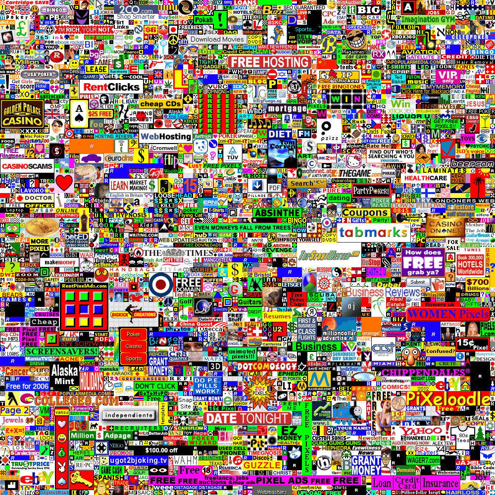
Tew’s concept was simple: A page with 1,000,000 pixels for $1 each, anyone can purchase blocks of them for advertising, and once they’re gone they’re gone.
This basic idea, simple execution, and astonishing success truly embodied the “novel idea makes thousands overnight” vibe a lot of the early internet had. There was no reason for the website to be of any value to advertisers besides the fact… it was there. There was no product, no investors, no corporate backing, just 1,000,000 pixels of unused advertising space.
Of course, this was back when online adverts were a beautiful wild west, where gambling, dating, free software (or malware) and illegal video downloads were all fair game. The end result is a stunning montage of mid-2000s internet, preserved in a 1000 x 1000 pixel bubble. Whilst I’d recommend visiting the eye burning original for a pixel-perfect version, here’s a smaller version (click to view full size):
So how on earth did this monstrosity masterpiece happen?
Why did it happen?
Alex Tew was a student looking to make a bit of cash to pay for his university degree, understandably wanting to break the “broke student” stereotype. The idea’s origin story listed in the (currently broken) FAQ1 describes the situation in Tew’s own words:
It was a muggy summer’s night late in August (2005), the time around midnight, and there I was, lying on my bed with a notepad, brainstorming ideas to make money for uni. I think I’m quite a creative person, so I wanted to come up with an idea that was unique and would hopefully capture people’s imagination, but with the whole purpose of making money. No point being shy about it! I think we brits can sometimes be too shy about money. Well bugger that, I DO NOT want to be a broke student!
So anyway, after an hour of two of jotting random things on paper, the idea seemingly popped out of nowhere. Almost like my subconscious mind had been ticking over in the background, working it all out. So it just kind of happened. That’s about it. I scribbled it down and within about 10 minutes a picture of what needed to be done had emerged.
What’s the timeline?
- 2005-08-24: Domain is registered2, for an initial cost of £50 for both the domain and hosting3
- 2005-08-26: Site is launched4
- 2005-08-29: First pixel sold5, with the first $1,000 from family and friends
- 2005-09-22: Covered on BBC6
- 2005-10-26: Over half of all pixels sold7
- 2006-01-01: Auction opened for final 1000 pixels8
- 2006-01-11: Final pixels sold9
Do all the links still work?
- 2017: 37% of links broken10.
- 2019: 40% of links broken11.
- 2022: 40% of links broken, as per the investigation below:
Link overview
In total, the 1,000,000 pixels have 3,306 different adverts. Many of these are by the same websites or companies, but this is the number defined on the page.
Out of these, 143 are “pending”, “reserved”, or otherwise never valid URLs for one reason or another. This leaves us with 3,163 valid adverts (see valids.txt). However, some of these are for the same domains (e.g. myspace), so we end up with 2,804 unique domains that our adverts point to (see domains.txt).
From these 2,804 domains, 550 completely fail to respond or don’t exist, 29 give server errors, and 531 give other errors, usually that the content is forbidden or can’t be found.
In conclusion, 1,694 of the 2,804 advert domains are still alive and responding properly!
Detailed results
| Result | Count | Response Code Breakdown |
|---|---|---|
| 2XX Success | 1694 (60.4%) | 200 OK: 1682 204 No Content: 12 |
| 4XX Client Error | 531 (19.0%) | 400 Bad Request: 9 401 Unauthorized: 1 403 Forbidden: 203 404 Not Found: 158 405 Method Not Allowed: 88 406 Not Acceptable: 63 409 Conflict: 1 410 Gone: 1 412 Precondition Failed: 5 429 Too Many Requests: 2 |
| 5XX Server Error | 29 (1.0%) | 500 Internal Server Error: 12 501 Not Implemented: 1 502 Bad Gateway: 2 503 Service Unavailable: 11 521: 1 530: 1 999: 1 |
| Timed out / unreachable | 550 (19.6%) |
A full set of response codes (and errors) is available at domain-status.txt
HTTPS
Interestingly, only 8 of these domains are HTTPS addresses on the site, whereas now almost all sites use it by default.
I had a theory that many of the errors above might be due to HTTPS redirects not working properly. To test this, I changed the list of 2,804 domains to all use HTTPS by default, and ran my checker again.
I was wrong however, and the 2,257 / 2,804 domains that could at least be connected to enough to throw an error dropped to a rather awful 1,498 / 2,804. Further investigation showed that this was likely due to my tool using an outdated HTTPS (technically SSL) protocol however, with the failed sites consisting of a mixture of very outdated (doesn’t support HTTPS) to very up-to-date (only supports modern HTTPS).
Link rot
Whilst I was fairly surprised only 40% of the links no longer work, I am curious how many of these domains only still exist due to their presence on Million Dollar Homepage. Considering link rot (old links slowly breaking) is estimated at around 50% of links per year12, so many links surviving 17 years later is truly astounding! Using average link rot figures, we would expect around 6% of links to still be working.
However, it’s worth mentioning that these link rot estimates are for random web pages, not those explicitly used for advertising which may be assumed to have higher value in keeping active.
Somewhat ironically, since most of the Million Dollar Homepage’s internal pages no longer work, the site itself has suffered much higher bit rot than the domains the adverts link to!
What colours are used?
When looking at the image, your eyes are drawn to… all of it at once. However, certain colours “pop” more, such as neon pink, green, or yellow. A logical question is… which colours are most used, and does this match how our eyes see the image?
Here are the top 10 colours used:
| Colour | Hex code | # of pixels |
|---|---|---|
| #1 | #010101 | 146147 |
| #2 | #ffffff | 144104 |
| #3 | #ff0000 | 45829 |
| #4 | #fefd00 | 37516 |
| #5 | #05ff05 | 26514 |
| #6 | #1700ff | 23572 |
| #7 | #ff07fb | 16545 |
| #8 | #e7e6e8 | 15473 |
| #9 | #251026 | 10657 |
| #10 | #d8d8d9 | 9894 |
As expected, the neon colours are the most widely used, in addition to the greyscale black / white colours.
Interestingly though, despite red, yellow, green being the top 3, looking at the site green pixels seem much more visible. This may be because green pixels tend to be part of larger advertisements, whilst yellow pixels are usually smaller adverts trying to be noticed.
A full list of colours (and # of pixels) are available as a JSON object.
What is Million Dollar Homepage’s legacy?
As with any simple idea that makes $1m in a few months, there were thousands of copycats! Most of these got negligible attention, and without the media attention quickly shut down.
r/place, a spiritual successor?
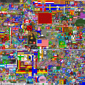
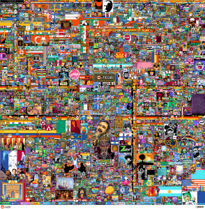
Perhaps more surprisingly, elements of this “canvas of pixels” idea can be seen alive today in concepts like Reddit’s r/place. Besides the general “individuals placing pixels, that form something greater than its parts” concept though, the differences are far more numerous than the similarities. r/place is free, pixels can be overwritten, and battles over areas of it are expected.
For evidence of their similarity, compare the Million Dollar Homepage’s final canvas to the 2017 and 2022 r/place results (click to view fullsize):
| Million Dollar Homepage | r/place 2017 | r/place 2022 |
|---|---|---|
 |
 |
 |
Perhaps even more impressive given how quickly events and websites can fade into obscurity on the internet, Tew’s Million Dollar Homepage is still referenced pretty regularly today, usually as a motivational “your idea can go big too!” example. Considering it still lives in mine and others13 heads 17 years later, it’s hard to understate the effect this relatively simple idea has had on countless online creators over the years.
Popularity over time
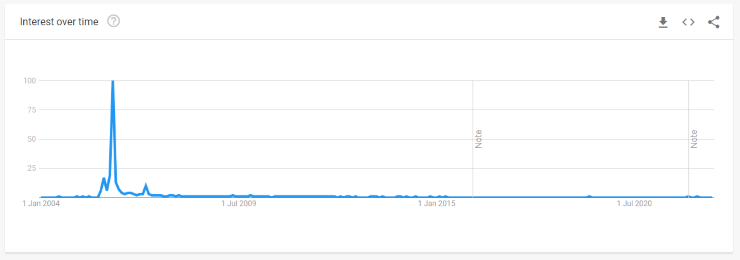
Using Google Trends14, we can get an idea of how interested the internet was in Million Dollar Homepage throughout the last ~18 years.
Whilst I expected one large spike of interest around the first media coverage (September ‘05), it turns out we actually have a “triple spike” pattern during the peak period. During this initial media coverage, there is an expected spike in search queries. However, there were over 5x as many around January ‘06, when the final pixels were being sold!
The third spike is less explainable, exactly a year later in January ‘07. My own theory is this is due to people remembering events from exactly a year ago. This theory unfortunately doesn’t have any evidence, and is perhaps countered by later years not experiencing this same pattern.
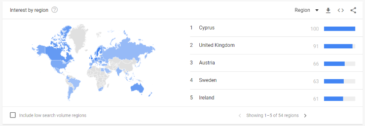
Finally, the site is unsurprisingly very popular in the UK (given Alex Tew’s nationality), but… also inexplicably Cyprus, Austria, Sweden, and Ireland. I have no idea why this is the case, suggestions welcome!
What order were the pixels purchased in?
The Web Design Museum has created a wonderful timelapse video showing the order the pixels were purchased in, and it’s worth watching the 14 seconds yourself:
A video of course speaks a thousand (million?) words, here’s a few observations:
- Unsurprisingly pixels at the top sell first. This is due to monitors at the time not being able to fit the entire page on the screen, leading to lower pixels being “below the fold” that 57% of viewing time is spent on15. The top half of the pixels are almost full before many bottom half pixels are sold.
- Pixels towards the left sell slightly better. This matches user experience research about horizontal attention16.
- Digital-first businesses moved in first. Companies offering web hosting, online betting, and online financial services were the first big spenders, presumably due to existing experience with a competitive online advertising marketplace.
- Over time, the advert customers get less and less “seedy”. Whilst the first adverts are “free” online content, dating, gambling, and similar services, towards the end adverts for Yahoo, eBay, The Times, and other large corporations are present. Of course, there’s no guarantee they were put there by the actual companies, it is feasible they’re intended to trick customers via an obscure method!
- There are very few creative pixel structures. Unlike r/place’s experience (see above), almost all purchased pixels were in rectangular blocks. The only visible exception is “Wizard Trivia”, which went for an interesting diagonal approach despite plenty of rectangles remaining. This approach seems unwise by the end though, with the advert almost invisible amongst the general chaos.
Where is the creator now?
Even more impressive than Alex Tew’s first $1m business idea was his ability to eventually spin this online clout and creativity into the meditation-focused startup Calm.com in 2013, now a unicorn (valuation >$1bn)17.
For a more detailed story of his journey from Million Dollar Homepage to co-founder of a billion-dollar company, I recommend The Hustle’s biopiece.
Conclusion
Million Dollar Homepage is the perfect artefact of a forgotten era of the internet. Despite (because of?) having broken links, eye-burning colours, and services of various legality and safety offered, the juxtaposition of serious businesses, one-man startups, and hobbyists provides a better description of the 2000s internet than any words could.
For me, the two most surprising discoveries during the creation of this article were:
- Alex Tew is flourishing and seems to have survived the early internet excellently. Many early internet online entrepreneurs have a much more mundane fate!
- There are more red and yellow pixels than green, despite being less noticeable. Modern advertising generally aims for a bit more design subtlety, and I struggled to find an article justifying this perception.
Finally, Million Dollar Homepage’s continued presence in hearts and minds 17 years later is a testament to how a fun little idea can quickly evolve into a major career contributor, and the importance of using family and friends for sales & promotion when possible!
Notes
How were the domains checked?
The process to check links was straightforward, but somewhat technical:
- Pull the full list of links from the source code of Million Dollar Homepage.
- Remove the surrounding HTML using regexes
^.*?(href=")&(" title).*$. - Sort the domains alphabetically, and remove duplicate domains.
- Manually look for & remove any fake domains (e.g.
http://reserved). - Check the domains using
vl(installed viapip install vl), specificallyvl domains.txt --debug > domain-status.txttaking around 10 minutes. - Sorting the results alphabetically, resulting in a list of domains grouped by response codes.
How were the colours counted and sorted?
This ended up being pretty technical, so a full write-up is available on my programming blog as How to count the number of pixels for each colour in an image.
References
-
https://web.archive.org/web/20120311152809/http://milliondollarhomepage.com/faq.php ↩
-
https://www.whatsmydns.net/domain-age?q=milliondollarhomepage.com ↩
-
http://news.bbc.co.uk/1/hi/magazine/4585026.stm#:~:text=Snowballing-,Alex%20spent%20%C2%A350,-on%20buying%20the ↩
-
https://web.archive.org/web/20090201203927/http://milliondollarhomepage.com/blog-archive.php#:~:text=Friday%2026th%20Aug%202005 ↩
-
https://web.archive.org/web/20090201203927/http://milliondollarhomepage.com/blog-archive.php#:~:text=Monday%2029th%20Aug%202005 ↩
-
https://web.archive.org/web/20090201203927/http://milliondollarhomepage.com/blog-archive.php#:~:text=Wednesday%2026th%20October%202005 ↩
-
https://web.archive.org/web/20090201203927/http://milliondollarhomepage.com/blog-archive.php#:~:text=%40%2011%3A56pm-,Sunday%201st%20January%202006,-Last%201%2C000%20pixels ↩
-
https://lil.law.harvard.edu/blog/2017/07/21/a-million-squandered-the-million-dollar-homepage-as-a-decaying-digital-artifact/ ↩
-
https://www.bbc.com/future/article/20190401-why-theres-so-little-left-of-the-early-internet ↩
-
https://blog.zomdir.com/2017/10/the-half-life-of-link-is-two-year.html ↩
-
https://trends.google.com/trends/explore?date=all&q=million%20dollar%20homepage ↩
-
https://www.nngroup.com/articles/horizontal-attention-original-research/ ↩
-
https://www.bloomberg.com/news/articles/2019-02-06/meditation-app-backed-by-ashton-kutcher-is-valued-at-1-billion ↩
